Friday, August 26, 2011

Curl

Curlby David R. Darrow
8" x 10" (20.3cm x 25.4cm)
Oil on Panel

SOLD
Collection of Suzie Gregory
Columbus, IN – USA

About This Painting

One of my Beautiful Strangers™ encounters led to this painting.

Beautiful Strangers are 'portraits of friends I have never met.'

I met Blythe in the market. She may have generated the slowest double-take on record. She was in line at the quick check-out at the grocery store, and I was on my way to the produce section and had to cut in front of her just to get by.

I smiled as I inched my cart into the space in front of her so she wouldn't think I was just busting through. She smiled at me and back up to let me through. And the light caught her just so.

I saw a painting in my mind as I passed by her.

All the way to the bagged Baby Spinach and organic carrots, I tried to talk myself out of asking her to be in a painting of mine. Finally, I just asked myself, "Who are you kidding? How are you going to paint a face like that if you don't ask her?"

So I did. And she agreed.

She was a natural. Every which way she turned her head she looked like another painting. She brushed her hair through her fingers and I said "Hold that... ...Okay... ...let go of your hair." A single strand of her hair dropped and curled around into the light.  ◙


To subscribe to my free "Art In Your InBox" Newsletter, just click here.

Tuesday, August 23, 2011

Sonoma Roadside

Sonoma Roadsideby David R. Darrow
8" x 10" (20.3cm x 25.4cm)
Oil on Panel

SOLD
Collection of George Reis
San Diego, CA – USA

About This Painting

Something happens to me when I drive through the lush, green fields of wine country. On a recent drive through Sonoma, I was taken by this scene at a glance as I drove by, so I went back to see it again — it ended up becoming a painting.

It had been a beautiful day, perfect weather, the slightest breeze. Driving with the windows down, smelling the rich earth mixed with a hint of salt air filtering in from the not-so-distant Pacific Ocean.

And now as the sun began its descent, the colors started to concentrate. The leaves, ever-so-slightly backlit, glowed a deep yellow green against the blue mountains.

I must go back.

Highway 12. Sonoma, CA. Wine Country.  ◙


To subscribe to my free "Art In Your InBox" Newsletter, just click here.

Sunday, August 21, 2011

Hot Pants

Hot Pantsby David R. Darrow
8" x 6" (20.3cm x 15.2cm)
Oil on Stretched, Washed Denim

SOLD
Collection of David Hansen
Milwaukee, WI – USA

About This Painting

Not just a couple of peppers. These are peppers from my own vegetable garden in San Jose, CA. And not just a still life on ordinary canvas – this painting is done on my old blue jeans... unstitched, washed and archivally stretched and glued onto a birch plywood panel, then gessoed with archival-quality, clear gesso.

Peppers on pants: Hot pants!  ◙


To subscribe to my free "Art In Your InBox" Newsletter, just click here.

Friday, August 19, 2011

A Stroll in Lucca Italy

A Stroll In Lucca, Italyby David R. Darrow
5" x 7" (12.7cm x 17.8cm)
Oil on Panel

SOLD
Collection of Leta Terrell
Lake Providence, LA – USA

About This Painting

I sometimes live vicariously through the lives of strangers, which is why I have on my Beautiful Strangers™ business card "Oil portraits of friends I have never met."

Getting to know the people who model for me is always a step into a new world.

And so it goes with clients who hire me to paint for them, as was the case with one client, recently, who wanted to gift his wife with a painting to remind her of the wonderful time they had together in a trip to Italy. I got to see his collection of snapshots and hear him talk about what memories he had of these various locations, the beauty, the moments that touched them both.

One in particular was a stroll around the section of Lucca (I believe he referred to it as Lucca Park). This walkway at the south-east of the walled city was strewn with Fall leaves and dappled sunlight, walled out on the right, and protected by a small berm on the left, seemingly endless in its forward distance.

I did this color sketch before the final, much larger painting to present to my client. He was pleased, and gave me the go-ahead for the final.  ◙


To subscribe to my free "Art In Your InBox" Newsletter, just click here.

Thursday, August 18, 2011

Creek at Broad St. – Looking East, San Luis Obispo

Creek At Broad St. – Looking East (San Luis Obispo)by David R. Darrow
6" x 8" (15.2cm x 20.3cm)
Oil on Canvas Panel

SOLD
Collection of Jan Krynski
Chicago, IL – USA

About This Painting

A while back I started a couple of paintings en plein air down by the creek near Broad Street in San Luis Obispo, CA. It's downtown, north of Higuera.

I finished one of them months ago. It was the view looking west. My own mother bought that one. She said she "had to have it" since it was a place my late father and she would stop for lunch when traveling south. They moved to the South San Francisco Bay during my second semester in Art School, and though Interstate 5 running through central California is 1.25 hours faster, they always took the slower SR-101 to Southern California since it is the more beautiful route. About 3.5 hours into it, it's great to stop in beautiful San Luis Obispo for a respite.

Now I myself am in San Jose, and when I head south to visit my kids, I take the 101 through SLO, too, and I make it a habit to stop off at this creek.

This is the second painting I started down in that creek area. This is the view looking east, and is equally beautiful.  ◙


To subscribe to my free "Art In Your InBox" Newsletter, just click here.

Wednesday, August 17, 2011

Nude with White Satin Scarf

Nude with White Satin Scarfby David R. Darrow
6" x 8" (15.2cm x 20.3cm)
Oil on Washed Denim on Panel

SOLD
Collection of George Reis
San Diego, CA – USA

About This Painting

  ◙


To subscribe to my free "Art In Your InBox" Newsletter, just click here.

Tuesday, August 16, 2011

Thomas James

Thomas Jamesby David R. Darrow
5" x 7" (12.7cm x 17.8cm)
Acrylic on Panel

SOLD
Collection of James Thomas
Santa Clara, CA – USA

About This Painting

Several months ago I gave a Head Painting Demonstration for a local artists group, and chose this fascinating looking gentleman from the audience to be my model (I added some of the scraggly appearance by use of artistic license — the model is actually a very nicely-groomed fellow).

He did an excellent job, like a pro.

I took 2 snapshots of the pose, thinking I might get back to the oil painting someday (still haven't).

And then last night I decided to drying slinging some acrylic paint around. I haven't painted in acrylic in 3 years or so, and I wanted to try out a build-up method of scumbling and glazing.

In the end I had a decent little painting. I made up the bandanna and blue shirt to give him a cowboy look, and reversed his real name (James Thomas) because I thought Thomas James sounded more Western... probably because of Jesse.   ◙


To subscribe to my free "Art In Your InBox" Newsletter, just click here.

Monday, May 09, 2011

Pitfalls of Art Contests and Donation Requests

Pop Art Trompe (Beer Can) - 18" x 24" Oil on Canvas
Ken Davies
I have for over 3 decades been enamored of the work of artist Ken Davies since acquiring his book Artist At Work. This book was a godsend when I bought it at H.G. Daniels in downtown Los Angeles, CA, during my art school days at age 21. I was trying to hone my skills at realism, and was meeting all sorts of opposition from faculty at Art Center College of Design — from, in particular, the chairman of the Illustration Department, Phil Hayes, who was a proponent of New York-style conceptual, editorial art, which at the time was taking a 'lunge toward grunge' and non-objectivity. Davies' work represented to me the pinnacle of the kind of realism that moved my soul at that time in my life. 15 years later I added his first book Painting Sharp-Focus Realism to my collection (the painter and my cousin, the late Raymond Page owned the book in his personal library and gave it to me some time before his passing).

One of my favorite stories, which to me typifies the lure of artist contests and the calls for fundraiser donations, is the following, as told by Ken Davies in his 1976 book Artist At Work, and is the description that accompanies the painting above which, I should add, is highly atypical of his work.
For over twenty years, I've been a member of the Silvermine Guild of Artists. Back in the late ’50s, I submitted a painting to their big, annual exhibition and it promptly got rejected. I think it was the first time a painting of mine had ever been rejected, so I was particularly anxious to go to the opening and see what the "good" paintings looked like. One accepted piece consisted of several crushed, rusty tin cans attached to a piece of wood. In those days, that was not a typical work of art, and so I was properly shocked. I was also annoyed at my rejection.

Several weeks later, when The Guild asked its membership to donate a painting for a fund-raising art auction, my annoyance returned and I thought I would be clever and sarcastic with my donation. I decided to paint the worst non-objective painting I could think of and then to paint a very realistic crushed beer can, complete with shadow as though it were attached to the canvas. When the painting was finished, I was rather pleased with myself. I could hardly wait to submit my masterpiece and get my revenge. I delivered it with an evil glint in my eye, then went home to await their shocked reaction. When the day of the art auction arrived and the results were announced, I was completely appalled. Not only had my horrible painting been sold, but it had brought an outrageous amount of money!

I never did find out who bought it and have not seen it since. But I'd love to know where my "backfired revenge" painting is today."

I wonder if Ken Davies ever found out who bought this painting. The book this is from was written in 1978.

Update!

I got a nice note from Ken Davies telling me he still (as of the publish date of this blog entry) does not know what became of the painting. The story was such a popular one that it has been re-published in his new book Ken Davies: American Realist which can be purchased from his website.

Tuesday, March 08, 2011

The Least Expensive Way to Mail An Original Painting

The past few weeks I have been on task with some graphic design work, working on a CD package and some website stuff. It was all fun work, so I actually did not mind that I was not painting much. I've needed a break from painting, anyway, "so I could miss it again..." — time to look through painters' work on Facebook albums and blogs — time to get inspired.

A few inspiring blogs for you to check out later:
  • The Broadview Blog - An interesting approach to understanding plein air painting. Concept Artist Robh Ruppel — also a student of the late Fred Fixler — demonstrates with digital media (Wacom tablet and stylus, plus Photoshop or other digital painting app.) how he constructs digital paintings that are every bit as amazing as those done in traditional media (which Ruppel also handles expertly)
  • Land Sketch and Nathan Fowkes Art — Two blogs by artist Nathan Fowkes who does extremely simple, little color and value studies to truly capture the essence of what he is looking it. Often using a combination of gouache (pronounced 'gwash') and watercolor in his little sketchbooks, these are gems, all. Take a look at his painting kit, shown at the top of Land Sketch. Gouache is the fancy name for high-quality opaque watercolor, sometimes called tempera.

Cheapest Mailing Available

I found a cheap way to mail paintings. The safety and condition is not guaranteed, but the reduction of postage costs is.
Painting Mail

Today, I am mailing to an artist friend of mine, using no packaging, a sketch that I started on a painting panel but know I won't get back to. That's right, I just wrote on the back like a postcard, addressed it, weighed it and put proper first-class postage on it. (I'm not completely stupid: I did wait for it to dry and then I varnished it). ;-)

I have no idea what it will look like when it gets there, but it seemed like a funny idea to me. Much better than tossing it in the trash or a fire. Someone will be surprised. And maybe a few postal workers will get a good eye-roll out of it.

Update: The recipient, my artist friend Annie Salness, called to let me know that it arrived in great shape, "not a scratch on it."

The Broadcast

Not sure when I will be back on (my broadcast Dave the Painting Guy), but I wanted to be in touch. I'll let you know by mass mail when I am back to broadcasting. Should be soon.

I may get on very soon and work more on another demo I started, at right. I painted a fellow named James who came to watch my demo for the Santa Clara Art Association on Wednesday March 2, 2011.

I only had about 1 hour to 1-hour-15-minutes to do an oil portrait (a little too lean on time for my taste), so I did not get terribly far. But as always, I had a great time.
 —Dave

Thursday, December 09, 2010

How Do I Start a Painting?

Often, one of the most difficult things about creating a painting is simply getting started.

Disclaimer, for art purists: There is absolutely no substitute for improving your drawing skills by participating in critical life drawing workshops. (By 'critical' I mean managed by an instructor who is willing to tell you your drawing is off and how to fix it). You can usually find one in your area. Drawing from the figure or head builds your drawing skills by training your mind/eye connection to accurately judge proportions and measurements. No matter how good you get at painting, you will always be making measurements — whether or not you deviate from absolute accuracy will be a matter of skill and/or style or choice.
You may want to start a painting before your skills are top-notch. And that's okay with me. I made a living for the first eight years of my illustration career before I began to learn to draw well from the figure. My painting improved once I learned, but for the bulk of my 17-year illustration career, I used three methods of layout: an optical projector, the grid method, or multiple tracings and transfer.


In the example above, I demonstrated to a private student how to use the grid method. I can go into this in more detail if enough people are interested, but essentially, your source material (photo, magazine image, quick sketch or cartoon, etc...) gets a grid drawn over it with equal divisions (unless you are trying to distort it, use perfect squares). Then, on your painting surface, larger or smaller, place a matching grid. It must match line for line, also with perfect squares, same number of squares. Whether the subsequent squares are larger or smaller does not matter but will make your drawing proportionately larger or smaller. You will use this to assist you in drawing accurately the contents of each square — example the left-most eye starts at the intersection of 4 across & 3 down on both the source and final.


Next, begin laying in the distinct shadow pattern. Treat it as if you have only a black marker and white paper. Get the pattern in. Just get it in. In this example, I am using a warmish mixture of Alizarin, Ultramarine Blue and Raw Umber for my darks.


You will want to paint in lighter values. Don't. Get the shadow pattern in. In areas that are dark, but may actually be lit by the source light, make them dark anyway. You can always lighten them later. Try to connect all shadow areas to others. No islands.


My apologies for the huge reflections in the wet paint. I had set the camera up over my shoulder using window light, before there was paint on the canvas, then just reached over my shoulder to snap new shots, and did not anticipate the reflection.
After you get the shadow pattern finished, fill in the light area with an average mid-value color for the light side. Reserve your highlights for later.


Be careful not to over-model the halftones in the light pattern. Keep your lights and darks separate. Mind your cool highlights if working with north light.
Once the masses are in, then you can play with edges. Edges are to a painting what spice is to food; what music is to romance. Edges help the viewer see what you see, and guide them to what's most important, what to spend less time looking at (the edge of the hair/background), what to know about the structure (cartilage under skin vs. soft cheeks vs. hair).
Annie in Yellow Sweater • 8" x 10" • Oil on Canvas Panel

by David R. Darrow

 
Collection of Larry and Kay Crain

Paint Smarter™
—Dave

Monday, December 06, 2010

Of Macs and Men

Okay, I need to address something... many of the viewers and my Facebook friends know that I am a Mac guy and have sworn by them for years.

Since I announced my computer issues and subsequent decision to buy a new one and the need to raise funds through my limited time Warm-Shadows Wednesday Workshop Sale and donations, I have received several e-mails asking me about my current level of devotion to Macs, given the number of problems I am having of late.

First of all, let me state that I have owned both Macs and PCs and do not engage in Mac vs PC slug-fests. I am simply thrilled to be living at a time such as this in which we can do the things we do with computers. In one of my online workshops last year I had attendees participating live from Oregon USA all the way to Belgium! That's amazing!

Still I prefer — and recommend without hesitation  — Macs.

Mac Has Not Failed Me

I need to explain that my computer problems have nothing to do with Apple or Macintosh. Yes, I thought it was a failing motherboard, but what I now believe to be the case is that it is a damaged segment of the computer perhaps related to the motherboard.

See, when I was moving to San Jose on April 1, 2010, I put all my stuff in the back of the truck and put my tower-style Mac G5 in the front with me. It was sitting on the floor where a passenger's feet might go. My assumption was that the ride would be smoother in the section where humans ride.

I could not have been more wrong.

There is no way to over-exaggerate the severe, up-and-down shaking I experienced at several [extended] points. It was like u-Haul was trying to shake loose change out of my head. The truck cab found a rhythm that grew and grew until it was absolutely unmanageable, not unlike when the washing machine gets out of balance and bounces itself upstairs splashing all its contents out.

It was violent.

My glasses flew across the cab, my coffee cup self-emptied, and my gall bladder removed itself. It was violent.

In the blurred hell that was my vision, I could see through the corner of my eye my Macintosh G5 being shaken up and down in a manner that would have resulted in a person being arrested if it had been another human being.

When I arrived at my destination, unpacked and began weeding through my belongings, I set up my Mac. To my astonishment, it restarted. But a week later the start-up hard drive failed... just would not turn on one day. Long story short, Seagate (drive manufacturer) fixed it and I got everything back, but still, not everything was right after that. Several replacement drives later, and with the camera problems happening only with my computer and not another, given the timing of the onset of problems I never had before, I conclude that the problems are from damage.

My Goal

My goal is to get a laptop powerful enough for the broadcasting tasks plus the extra stuff I use, iTunes, Photoshop, etc, during the broadcast. I'd like to be able to broadcast remotely sometimes... taking the show with me to other locations, where, if I find wifi available, I can do a show there... like sketching people at a coffee shop or painting a beautiful view near enough to someone's wifi... I dunno. Could open possibilities.

So Far

Several people have taken advantage of the lowered prices on the workshops and several others have donated, too. I am grateful for your involvement in the broadcast. I'll keep you posted. :-) With the money I have set aside for a purchase, plus the recent sales, I feel it is getting close...

Thank you,

—Dave

PS: The discounted "Warm-Shadows Wednesday" Workshops sale is being extended a little longer.

Wednesday, December 01, 2010

Restarting the Broadcast Soon.

The Dave the Painting Guy show has a huge problem: to be a show, it must broadcast. At the moment, no one is watching me paint except cobs. (They make cobwebs, of course). That is because I am not broadcasting. And that is because I cannot.

It appears my broadcasting problem is related to a damaged motherboard, or possibly the "i/o circuit" (that's computer talk for "i/o circuit"). To see what I am referring to, view this video. (Ignore the word "Start" in the middle. It was a screen capture).

Evidence of GlitchWithin my first broadcast in San Jose, April 23 (three weeks after moving here) my main cam started doing that weird glitchie thing. I assumed it was the camera, a cable or something else, but with each broadcast since then, it has become less stable.

I am finally ready to get back to broadcasting at least twice weekly, but I find I cannot broadcast at all. (Bummer) I am going to have to buy a new computer, and I do not have enough cash for it.

So we're on hold until I replace my broadcasting computer so I can once again regularly broadcast the Dave the Painting Guy Paintcast™ — Sorry!

Sunday, November 14, 2010

Creek at Broad Street - San Luis Obispo

Creek at Broad Streetby David R. Darrow
6" x 6" (15.2cm x 15.2cm)
Oil on Canvas Panel

SOLD
Collection of Doris Darrow
Sunnyvale, CA – USA

About This Painting

A few weeks ago I visited San Luis Obispo, CA for the annual plein air event. I haven't been to SLO for decades, so it was nice to see what's changed and what hasn't.

The Thursday night Farmer's Market on Higuera Street downtown beats any street party I have ever seen. With evening light speckling the streets through the trees while the smoky aroma of meat on grills fills the air, vendors display produce, various wares, creams, ointments, incense, health drinks, jewelry and so on — it's a street-fair on steroids every week!

Just around the corner, Broad Street crosses a beautiful little creek, just a few feet south of the San Luis Obispo Art Center where the plein air festival has its gallery. This creek meanders through town, popping in and out of view, sometimes running under several blocks of downtown's multi-story buildings betraying its centuries-old, natural history of following the path of least resistance.

One morning I parked my easel by the creek between Chorro and Broad, and began this little painting in the warm morning sun as passers by chatted or friends gathered above the creek for morning coffee and conversation at any of several establishments with balconies or patios overlooking this serene view from their manufactured vistas.
  ◙


To subscribe to my free "Art In Your InBox" Newsletter, just click here.

Tuesday, November 09, 2010

Covered in Light

Covered in Lightby David R. Darrow
3-3/4" x 8" (9.5cm x 20.3cm)
Oil on Canvas Panel

SOLD
Collection of Chris Opp
Bossier City, LA – USA

About This Painting

A quick figure painting on a small, remnant canvas panel, done in a limited palette, using red, yellow, black and white.  ◙


To subscribe to my free "Art In Your InBox" Newsletter, just click here.

Thursday, November 04, 2010

Pouring From A One-Gallon Metal Can

Okay, this might seem like a no-brainer: Remove cap and tip liquid out. Wipe up excess from table.

But there is a better way to pour that is non-intuitive but takes the spill out of the equation, even with gallon cans filled to the top, like my Webber's Turpenoid Natural, here, or the new Gamsol cans (each of which has a new, easy-open, pull-out plastic seal).

My dad taught me this as a kid filling the lawnmower. To get the cleanest pour, get the pour-hole diagonally as far from the target as possible, or "pour across the can" as he put it.

What this does is keep as much of the liquid away from the edge of the pour hole until you are just past the tipping point, allowing the top of the can to tip down and under, out of the way, with the added benefit that the level of the liquid will not as-otherwise-likely reach the top of the pour spout, sealing it off, causing the "glugging" that makes a huge mess.

Try it! It just pours straight down, no glugging.

Wednesday, October 27, 2010

$78 Life Saver

Would you pay me $78 if I could restore your entire Mac start-up drive and all its files back to working order in under 4 hours? Would you pay me even more if you knew I was the best way to get all your photos and movies and e-mails back and have your drive in the same condition it was before your drive crashed?

Then why not pay yourself for the same thing in advance?

If you are using Mac Leopard (OS 10.5) or higher, you have Time Machine included with your Mac OS, and you should just use it.

You can get a 500GB hard drive that is powered from the very USB port you plug it into for $78 shipped, and begin using it to back up your system within 5 minutes of receiving it.

It's a little bigger than a pack of cards and needs only the included, manageable USB cable.

Just the other day my start-up drive died. I bought a new one, stuck it in my Mac and formatted it for Mac OS. I then restarted my Mac from the Leopard OS Install disc. Once it started up, I went to the Utilities menu of the start-up screen and chose "Restore Stem from Time Machine Back-up" at the bottom of the menu list.

After pointing to the most recent back up that I felt was safe, and to the new drive I wanted to write to, I clicked "start." In my case, my start-up drive had 700GB to restore, so it took me longer than most folks. But in four hours it was done, and I was back online with all my apps still installed and working.

That is the easiest recovery I have ever done. By far. It used to take days or weeks.

Do it now.

Classic Sanden Book - Painting the Head in Oil

Some time ago at a garage sale or old book store I stumbled on this 1976 book, Painting the Head in Oil, by John Howard Sanden. If memory serves me, I was not yet an oil painter, but dreamed of one day abandoning the slapdash, hurried, frequent-all-nighter schedule of a commercial illustrator in favor of leisurely painting subjects in my spacious, 2-stories-tall, natural-light, north-facing windowed portrait studio.

Hey, I can dream, can't I?

I was young, full of future, butbusy raising a family... and there wasn't an internet back then, so I really did not know who Sanden was. But one glance through his book told me that he knew what he was talking about. He was a portrait painter.

And he's one of those painters whose brush marks leave proof that he is in full control of his paint at all times. His paintings are never overworked, and always present a good and flattering likeness. He's painted some of the most famous people in the world, including very famous people you've never heard of. (This irony in pictures was the beginning of my understanding that the world is bigger than I could imagine).

Unlike many art books on portraiture that display fine examples of a master's work, with little practical how-to, this one talks about flesh-tone colors, mixing, premixing, mediums, and much more.

If I have one criticism, it is at the same time praise for Sanden who, due to his tremendous skill and eye for proportion, still makes portrait painting look too easy. But that is not the fault of either the author nor the publisher. The publishers are not painters nor even faintly expert in that which they publish. They are about selling books. What do they know about painting to even ask for additional clarity?

And Sanden? He's so good that when it comes to explaining some aspects of his own methods of painting, there are some issues that are so basic and instinctual to him that he probably cannot imagine they need explaining. Such is the caveat of mastery.

Thursday, September 23, 2010

Review: New Book about Illustrator Drew Struzan's Work

2010 Book about Drew Struzan

Updated

There's a new book about a good portion of Drew Struzan's movie poster career. It's released date is September 24, 2010, and at the time of this writing is being sold at about 30% off at Amazon. It's called The Art of Drew Struzan.
Use www.ClickFiller.com to find a low-priced item to bring your total to $25 or more for free shipping where available.

Review

I received my copy early, and dived right in. I had 6 or 7 years experience as an illustrator in the movie poster design field myself, and just looking at the images brought back some fond — and some depressing — memories.

The book is full of movie posters — not all of them, though, to my disappointment — a selection from his career, showing both comps and finishes. Knowing that this was only a selection of a larger body of work, one gets the feeling this guy worked day and night to complete so much excellent work.

The surprise for me was that much of the text purports to be Drew's own words discussing his artwork. Some of the phrasing does not sound like the Drew I have met and feel like I know, though. Nevertheless, it seems to be a telling of a career in an industry that used up, chewed up and spit out one of the last great 'traditional' illustrators of our time. (Traditional in the sense that he created his art with art supplies in combination with his eyes, mind and hands).

"Big Trouble in Little China"
©Drew Struzan
From the foreword by Frank Darabont (Director, The Shawshank Redemption, The Green Mile, The Mist) to the end of the book, the message is about the glory of the process of creating great art, and a lament that it is ultimately about money for the corporations that dish out movies, committees of people who believe they are actually important, making decisions in areas of visual appeal for which they can never hope to be qualified. Far from being a sour grapes tell-all (names are withheld to protect the tasteless, but a few punches are thrown nonetheless), Struzan speaks of gratitude for what his career afforded him, yet between the lines you read how easily for him came the decision to retire.

That language is raw and unvarnished at times from all contributors to the book, PG-13, as it were. It was, after all, a career in Hollywood.

For the visual artist, painter, or illustrator, the book is a virtual treasure chest of examples of how to design within (and without) a rectangle; how a work flows, how to control the viewer's eyes, and how to successfully tie elements of a montage together. Today's digital 'artists' with Photoshop and a Wacom tablet would do well to study this book for the use of color, transition, design and texture, use of lighting for drama and staging, and the absolute need for compelling imagery Drew's images demonstrate. A few years spent learning in a solid art school that teaches those things wouldn't hurt, either... if one can be found anymore.

There are three illustrators that influenced me more than any one else in my career, besides Norman Rockwell and JC Leyendecker of the past, and I was fortunate to get to be friends with each of them, often competing for work. Steven Chorney, who did nearly every piece of art inside the TV guide for years, Drew Struzan, (he pronounces it "STROO-zn") who was also a friend of Steve's and who was to movie posters what Norman Rockwell and Leyendecker were to magazine covers and advertising art, and Morgan Weistling, a 19-year-old kid who at the time had a growing reputation along the lines of "he's even better than Drew Struzan!" As much as I admire my friend Morgan's work, and am grateful for his substantial influence on my understanding of painting, Drew is a legend, too! From the first piece of his I ever saw and liked immediately— an Alice Cooper album cover from my high school graduation year, 1975 — to, well, everything he's done. I would learn later that Drew was 28 years old when he did that piece of art.
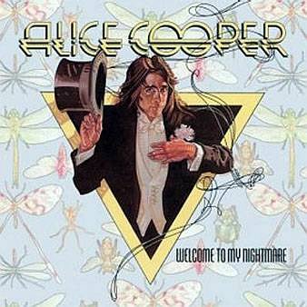
Alice Cooper Album Cover - Struzan
The album cover for Alice Cooper's Welcome To My Nightmare —not my cup of tea, but I ran into the album at a friend's house — was something I recognized as a beautiful design and decorative figure reminiscent of JC Leyendecker's paintings, whose work along with Norman Rockwell's I was just getting acquainted with at the time.

In 1987, I was attending a "Portfolio Review" sponsored by the Society of Illustrators. Drew was to be one of the reviewers, and I had wanted to meet him for about 10 years. I'd heard stories about what a remarkable student he was when he attended Art Center, years before I did.

Since I had been making a living as an artist for the previous 7 years at that time, I did not present my portfolio for review, since it was more for students or beginning illustrators. The evening was winding down and Drew's review station was empty so I went and introduced myself. After awkwardly telling him what a pleasure it was to meet him, and "I'm your biggest fan" and all that, he said "Well, show me what you've got..." gesturing to my portfolio that I had in my hand.

"Oh, no... I wasn't here for reviews, I just... uh... I don't really want you to see my..."

"Come on. We're in the same business. let's see it," he insisted with a smile.

I won't bore you with the details, but he was very complimentary — and then said, "Your work lacks love."

"Love?"

"Yes. It doesn't look like you love doing this for a living."

"Well, really, I don't. It's tedious, hard work, and I do too many all-nighters. I have a growing family to feed and I am always tired."

He asked me how much I made in my best year, and so I told him that this was my best year so far, and I was on track to make xx dollars." His eyes widened, and I thought he was going to scold me for complaining when I was making plenty in a tough field. Instead he said, "I make that much in a month. No wonder you don't like your work."

JFK by Darrow
He asked me to show him just one piece I loved, and so I showed him my illustration of John F. Kennedy, right, that I had done for the 1983 20th anniversary of the assassination, to be used for a local San Diego TV-guide-like magazine called Tuned-in.

That was a bit embarrassing, since it was a direct knock off of the style of another favorite of mine, Richard Amsel, who'd done a slew of TV Guide covers, many of which I had collected and hung on my wall in my studio.

John Travolta by Amsel
In fact, Richard had done the first Indiana Jones and the Temple of Doom poster, the series of which Drew Struzan dominated after Richard's death in Nov. 1985 from a relatively new disease at the time, AIDS. Amsel's final work was a cover for TV Guide with portraits of Dan Rather, Peter Jennings and Tom Brokaw. Amsel died three weeks after its completion.

Drew asked me why I loved that one. I just shrugged and told him that it was because I got it done quickly. It only took a few hours. (I never told him I only got $100 for it). He said, quite matter-of-factly, "Well, that's no small thing. Maybe you're not cut out for all the detailed and tedious work. I could never do what you do [referring to the rest of my portfolio's tedious stuff]."

It had never dawned on me to choose to do work that fit my personality. I had thought it was a virtue to be thankful for work at all, and just do it.

Without missing a beat, Drew invited me to his home and studio in Lake Arrowhead, and for that day, about 3 weeks later, Drew took me under his wing, showing me dozens of originals and even a slide show he'd put together for public meetings showing his methods, start to finish. I was in Illustrator Heaven.

David R. Darrow & Drew Struzan 2009
Drew's generosity and directness breathed hope into a 30-year-old illustrator that year. I will forever be grateful.

22 years later, I ran into Drew and his wife Dylan at the Pasadena Museum of California Art, and was delighted that he remembered my name. He had a few very nice pieces in the gallery show, including a figurative sculpture and several oil paintings.

It was great to see him and if you'll excuse me, I must go buy his new book, The Art of Drew Struzan.

Wednesday, September 15, 2010

Studying Leyendecker

Lately, as I contemplate which direction I want to go next with my oil painting, I have been studying the elegance and simplicity of line and form in the work of turn-of-the-century illustrator J.C. Leyendecker [Amazon book link].

Of particular interest to me was his use of color sketches on canvas, his unique "grid-method" transfers, and exaggeration of the effects of light and shadow, in particular 'form shadows' or 'core shadows.' He always maintained a balance of cool and warm to help separate lights, too.

In one instance I found, left, he apparently painted the sketch the way he wanted it, then drew grid-lines through the still-wet oil paint to transfer the image to a another, perhaps larger canvas.

Sadly, Joe Leyendecker was very secretive about his work, taking with him to his grave his "secret medium" that allowed him to "draw fluidly with paint." Still, a student of his images could learn a lot about composition, conservation of line, beauty of shape, simplified volumes and idealization of face and figure.
This is the newest book of many about his work, and is filled with excellent pictures. It comes highly recommended — by me — for its beautiful pictures and examples, but probably not the quality of the text. Besides the authors' elevating Leyendecker by unnecessarily bashing my other early 20th century hero Norman Rockwell, stating opinion as fact, they assert that Rockwell definitely copied Leyendecker. How do they know something that I highly doubt? I have been studying both illustrators for nearly 40 years.

Plus I found the text to be highly speculative and overly concerned [to the point of the unmistakable stench of misplaced agenda] with the sexual preferences of this master Illustrator. — David R. Darrow

Tuesday, June 29, 2010

Fredrix Illustration Goof-up

As someone who has been stretching his own canvases for 30+ years, I was surprised to find a different method illustrated on the back of the blister packaging for my new pair of Fredrix Canvas Pliers. In fact, at a glance as I was tossing it in the trash, the image registered as wrong to me.

Can you tell what the problem is?

Well, I went to www.fredrixartistcanvas.com as they directed me to, which redirected me automatically to its 'new' home www.taramaterials.com, not technically a goof, since companies are bought and sold and domains change all the time.

Tara Materials has been the sole owner of Fredrix Artist Canvas since 1968, when Arthur Freidrich sold the NY based canvas manufacturer to a couple of guys from Atlanta.

I recently purchased my second pair of canvas pliers in 33 years because the first ones broke. Can you believe something I bought in college would only last 33 years or so? But way back in college, I learned that to properly stretch a canvas you tack stretched canvas starting in the middle of each bar and work the opposite side for the next tack.

The Fredrix canvas "mounting" instructions, while not very clear, are in agreement with what I was taught about working from the center out and across.

But look at the staples in the illustration.

Fail.
Yes, I am picking on Fredrix for their packaging, but it is all tongue-in-cheek — I am confident in most any of their products, and as with any manufacturer, they produce varying qualities of some products to suit certain needs.

I am confident that the average artist who only stretches a few dozen canvases a year will do just fine with a set of generic canvas pliers, just as well as another brand for $15 more or, if you want to have exactly what I am using (and they do have some nice additional features, like a wider grip and a grip-handle stop at the far end to, presumably prevent breakage) you might want to go ahead and pony up the extra few bucks to get the Fredrix canvas pliers.

Sunday, June 27, 2010

Remembering Dad

My father died 5 years ago today, a little after 10am. I knew then that life will never be the same, and I have been right.

But that's not a bad thing. And it's not an entirely good thing either.

Life goes on. The pain of his death, for me, is gone. I have accepted it. Nevertheless, there is a feeling of missing that is neither painful nor comfortable, but something in between... a resolution that this is just the way life goes... chipping away at us day by day. Giving and taking.

I like the mountain tops much more than the valleys. But I have to admit I learn so much more in the valleys.

Thursday, June 17, 2010

I'll Get the Wine

I'll Get The Wineby David R. Darrow
6" x 6" (15.2cm x 15.2cm)
Oil on Panel
Framed and Ready to Hang

AVAILABLE
Framed
$125 + $9.99 S/H

Click here to buy with Paypal

About This Painting

On a recent trip to Santa Fe, NM, I stopped by one gallery a little ways off the well-known gallery row. Traffic must have been slow for this gallery, for they were closed that day.

The gallery has an inviting courtyard, with a patio and overgrown wildflowers everywhere. Seeing these two Adirondack chairs beckoning two lovers to sit and rest, the phrase "I'll get the wine..." came to mind.  ◙


To subscribe to my free "Art In Your InBox" Newsletter, just click here.

He Bangs!

Poor George. My brain gasped when I opened his e-mail and saw this picture. George is my 167-year-old artist friend from San Diego with whom, not long ago, I chatted and drank wine when I visited him at his home and studio. I wrote about it here.

It seems George is spatially-and-vertically-challenged at times, and he blames his trifocals for blurring his feet sometimes. (It's true. When he wears trifocals, no one can actually see his feet. Amazing).

George's e-mail, titled Don't worry, it's just my head... said:
Hear I am trying to have woman friends, had regular Monday cuppa with Ann Marie, took my Liberty Station walk, visited the building I saved from a serial arsonist in the 1960's — and missed three very low steps, thinking it was level to the door because of my trifocals which fuzz out my feet.

And the arsonist got his revenge — Over 20 sutures over my right eyebrow, a beauty of a black eye, and a compression skull cap.
George was able to use his cellphone to call his son, who came and picked him up and drove hi to his private physician for clean-up and repair, thus avoiding the huge bill that would have been slapped on him had he called 911. (Not to mention, when you call 911 on a cell phone, you reach Highway Patrol by default, which wouldn't have been of much use, either.)

I got updated with this newer photo today. Nothing against your otherwise good looks, George, but the location of your new scar is strangely reminiscent of Frankenstein's monster. 

Chicks dig scars.

Update
George sent me a self-portrait he did today (Father's Day 2010). He decided to stay home from church today since he thought he would only frighten people. He's right. Of course in the some churches, he could have had people slapping him in  the forehead commanding him to "Be Healed!" That doesn;t sound so friendly, does it.

I think it was a good idea to stay away from churches today.

George, promise me you'll ask your doctor when you go back — with a straight face — "Doc, am I gonna have a scar there for the rest of my life?"

I want to know what he/she says.

Sunday, June 13, 2010

Diversive De-cobwebbing

As a means to avoid making big problems on my commissioned painting that I still have yet to start, I create a diversion for myself, convincing myself it will get the cobwebs out of my head.

I am so distracted these days. The 92°f stifling heat in San Jose, the absolute silence of my home, the pressure of a deadline, the major changes in my life... all contribute to my anxiety, but I feel better at least painting something, even if it's not my real job.

Last night I painted this 16 x 20 for a bit more than an hour while watching a movie. Stage 1 (click the picture) was about as far as I got.

Stage 2 was today's work. I set the timer for 30 minutes just to get warmed up, but wasted about 20 on other things... putting out paint, etc. When the timer went off, I reset it and painted another 30 minutes, so about 40 minutes altogether.

Warming Up

Summer is about here, and San Jose is hot. Last evening, I could hardly wait for the sun to simply go away so it would stop heating everything up. Bonus: I now understand better the meaning of 'stifling.'

I have a commission on the easel that I am approaching gingerly. By that I mean I am avoiding it by any logical means possible. After stretching a canvas of Belgian linen and preparing to start, I noticed that there were slight ripples on the long edge of what should have been a taut canvas. I knew that the only remedy was to remove all the staples and start again. But I waited 2 hours to start removing staples.

It was Saturday, and I needed to ship the painting Wednesday.

In a moment of superhuman strength I snapped off one of the gripper heads of my canvas pliers — the pair I have had since art school over 30 years ago.

The cast metal just broke.

It was 4pm on a Saturday, and I had just removed the last staple from a fairly taut canvas, was now reattaching the canvas and tightening it up for my second staple when "Snap!" — now I had no way of reattaching the canvas.

Fortunately, a local art supply store had a pair, and I was able to buy a new pliers (is/are pliers singular or plural?) for a mere $32 and rush back home to try them out.

I mourned a bit for the loss of my old friend since college. How could it have happened just like that? They served me well for so long with not even a hint of being stressed.

After successfully re-stretching the canvas, I decided I had better practice painting, first... feeling a little rusty, I suppose. I painted a practice painting, and went to bed. Today, I must actually paint my commission.

Tuesday, March 02, 2010

George

I got to visit my friend George yesterday. George is now officially a collector of my work, owning 2 of my paintings. George sneaked in at the last moment and snagged my painting John Wayne in Acrylic the other day in an eBay auction. George is a painter, too, and he and I became acquainted in 2007 because George had found my work on eBay, looked me up and even sent me a painting of me from a photo on a blog entry about a day I went plein air painting and my painting blew off the easel landing 'jelly side down.'

George is one of the kindest men I have met, and in many ways his gentleness and careful choice of words, easy laughter and substantial vocabulary remind me of my own father who passed away in 2005. I would venture that If it weren't for his knack for story telling, and his myriad stories from his career, you'd probably never guess he spent a good portion of his life as a Special Agent for NCIS (NCISA Who's Who Story: scroll halfway down).

I delivered the painting to him and he smiled, thanked me, shook my hand and set it down on his coffee table. I had to admit to George that I could not imagine why he wanted another painting. Far from being self-effacing with that question, I was referencing George's enormous collection of paintings, the vast majority of which are his own. He long ago ran out of wall-space in his four bedroom home, and both sides of his garage are modified with shelves loaded with paintings, categorized and alphabetized. It's like a library or vinyl album collection, only the collection is all paintings on panels or canvas, sometimes still in frames, but mostly loose.

As we drank a glass of wine together, we talked about art, painting, his career, his fun memories of his duties an a special agent, the art of getting a confession (for much of his career he obtained more confessions from criminals than anyone else around using psychology, relationship-building and a polygraph machine -- much more often than not, the polygraph was unnecessary), and of course we talked about Pearl.

He's done between 200 and 300 paintings of his late wife Pearl among the hundreds if not thousands of paintings he's done. Pearl was the love of his life and he is never at a loss for words describing the beauty and gentleness of the woman who preserved his heart in a career that could have stripped him of it.

"I've never known a more selfless person in my whole life," he sighs.

Sadly, cancer took her life 7 years ago, and George was left with a home full of memories of her and their children together -- and his box of paints. He visits her grave site a couple of times a week, and talks to her, hoping she's around somewhere to hear.

I once heard that a "real" artist is one who will spend days, weeks or months on a creative pursuit and never care if anyone ever sees the work. This is largely true of George. The vast majority of his oil paintings are in deep stacks along the walls in his studio, the garage, on the piano, and so on. He mostly does portraits and figures, and if it were not for a visit to his home, or catching his fancy as a friend to whom he'd like to give an original portrait, you'd never know otherwise that he paints. He's doesn't try to sell them, but for some commissions he talks about. Many people who have been blessed to know him have received a portrait from him as a gift.

Painting is what he loves to do to pass the slow-moving time and remember his friends, and especially his favorite model of all time, Pearl.

Mary

Maryby David R. Darrow
14" x 11" (35.6cm x 27.9cm)
Oil on Canvas Panel

SOLD
Collection of Jose Arce
Jacksonville, IL – USA

About This Painting

Mary was a stranger to me the day I asked her if I could paint her portrait. I was struck by her wonderful multi-braided hair and dark, dark skin.

"Excuse me..." I said, interrupting her thoughts. I was going to ask her if I might possibly use her as a head model for study.

She turned and smiled a beyond-radiant smile. We talked for a bit and I explained what I do and that I'd like to paint her. I also mentioned I was being awarded a First Place at a local gallery's juried show and invited her to the reception.

She showed up with two of her nieces, who were equally beautiful, and whom I eventually painted, too.

All three young women are originally from Kenya, and Mary is aunt to the other two. They are named Dama and Dama – they are each the first daughter in their respective families and, following tradition, are named after their maternal grandmother who is, of course, Dama.  ◙


To subscribe to my free "Art In Your InBox" Newsletter, just click here.

Presence

Presenceby David R. Darrow
11" x 14" (27.9cm x 35.6cm)
Oil on Belgian Linen Panel

SOLD
Collection of Delilah Smith
Oldsmar, FL – USA

About This Painting

"She's a ballet dancer," my wife suddenly pointed out.

My wife – who has been in dance from childhood through most of her adult life – was out with me for breakfast one sunny Sunday morning at the harbor in Oceanside, CA. Erika was walking nearby with her mother.

From a short distance I was caught by something about her face. I haven't been around dance enough to pick up what my wife did, but she told me she just knew it "because of the way she carries herself."

I set down my fork and got up. "Let's go find out if she is. I'd like to paint her anyway." She has a long neck, lean frame, muscular arms and a gentle but focused, pretty face. At that moment, her hair was pulled back tight and put up in a bun.

Erika, 14 at the time, and her mother were delightful people to talk to and verified that Erika was indeed a dancer – a serious dancer, traveling the world with well-known companies. They told us that they were on vacation from their hometown in Florida and, fortunately for me, agreed to come by my studio the next day.

There is something that sets one dancer out from the rest, even though they may have similar training, athletic ability, grace and strength. What set her apart was what my wife saw, and what I wanted to capture.

Presence.  ◙


To subscribe to my free "Art In Your InBox" Newsletter, just click here.

Saturday, February 27, 2010

Feminine Model Study in 5 Values

Feminine Color Study in 5 Valuesby David R. Darrow
6" x 6" (15.2cm x 15.2cm)
Oil on Panel

SOLD
Collection of Denise Rich
El Cajon, CA – USA

About This Painting

Sometimes an artist wants to see what he or she can accomplish with as few strokes as possible and still communicate to the viewer the essence of what the artist saw.

To do this four fundamentals are needed, Drawing (Proportion), Value (Light to Dark), Edges (Transitions between shapes and hues) and Color (Hue). These have been listed in the order of importance, in my opinion.

Here, I did a study using 5 values of a few hues in rapid fashion to "make notes" of the model's face. Rendering and realism are not important here, just the placement and shape of the values.  ◙


To subscribe to my free "Art In Your InBox" Newsletter, just click here.
